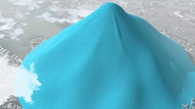
A delicate, shimmering orb, balanced on the curved and uneven surface of Earth, casting a soft shadow over New Orleans and Houston. It looks ready, at the slightest vibration, to slip off, lost forever to the vastness of space. This is all the water on Earth. Not just all the fresh water, but all water. Accessible fresh water (the H2O that is in rivers, lakes and shallow groundwater – less than 750 metres below the surface) … that’s the tiny drop sitting on New York. The even smaller drop in the middle is all the water in the world’s rivers, lakes and soils.
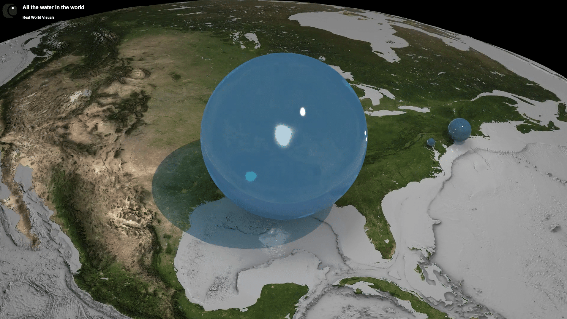
It’s probably a lot less than you thought, and seeing it like this makes you realise just how precious water is (and perhaps worry if you left the tap running). The precariousness, the ease with which it looks like that precious drop could be shaken off the Earth also reminds us not to take such ecological wealth for granted.
This is the purpose of Real World Visuals, a company co-founded by OR Antony Turner (1966, B): turning often impenetrable numbers or mind-boggling volumes into relatable imagery – bringing data to life.
Inspired by Geology don David Fielding, Antony left Radley with an A-level in Geology, but no immediate plan of what to do next. As a young man, he bounced between disparate roles: working at a hamburger bar on the King’s Road, on a deer stalking estate in Scotland, as a motorcycle messenger, and in a kitchenware shop in London.
At the age of nineteen, he landed an office job in an entrepreneurial company supplying to the emerging offshore oil and gas market in the UK North Sea. He found he had a knack for selling innovative technical solutions and soon teamed up with a Finnish engineer and inventor as agent for a novel piping technology. Ten years later he became Marketing Director theren, launching several technologies around the world, the last of which, Hi-Fog fire protection, is installed on 90% of the world’s cruise ships.
In his mid-40s, Antony hit what he describes as a bit of a mid-life crisis. Looking to explore something with more depth of meaning, reflecting on his past enjoyment of being outdoors, and mulling over encounters with radical and environmental thinkers, he enrolled for a few courses at Schumacher College, located on the historic Dartington Estate near Totnes. Inspired by the economist and environmentalist E. F. Schumacher and founded by scholar and activist Satish Kumar among others, Schumacher College ran courses which challenged conventional thinking and focused on ecology and sustainability.
This initial three-week course, which brought business people together to consider how sustainability and environmental responsibility could be brought into focus within the corporate world, chimed for Antony in a way that he had not expected. Just a couple of years later, in the late 1990s, he helped the College design a new programme called ‘Business and Sustainability’, at a time when it was still unheard of to combine those two words.
“I came out of Schumacher College realising that we exist, just like the bacteria on our skin, on a living planet. And I felt that climate change could be communicated in a better way. Throughout my career, whenever I’ve been selling things, I’ve used pictures, images – communicating in a visual way to tell a particular story. I made a decision to stop working for a brief period of time and focus on just investigating the science of climate change. I put together a slide deck, which I started to show people in businesses and organisations … and it just grew from there.”
Antony built these conversations into a pioneering consultancy called CarbonSense, and over the next five years he found himself presenting in the boardrooms of some of the world’s biggest companies such as TNT, and BT, arranging talks at HM Treasury, and helping with communication around the Honda F1 Earth car.
“I realised that a core reason why climate change had not been properly recognised was that greenhouse gases are invisible. It used to be that you’d see huge black plumes coming from vehicle exhausts as they went up steep hills, but particulate regulations mean you don’t see that now. But the CO2 is still there.”
Globally, 100 million tonnes of CO2 are emitted daily from the burning of fossil fuels. Spread evenly across the global atmosphere, that’s a layer around 100 microns thick – about the thickness of a standard sheet of 80gsm paper, so, each year, human activity is wrapping the Earth in over 3.5 cms of CO2. At current emission rates, that’s a layer nearly 3 metres thick over the course of a human lifetime.
“CO2 reflects heat back down to the Earth’s surface, trapping heat from the sun and our activities, which means that global temperatures are going up. A hotter planet means more intense rainfall and flooding in some places and means droughts in others. The natural heating and cooling systems of the planet and the ocean currents are seriously hampered.”
The 2008 economic crash meant smaller corporate budgets to dedicate to climate consultancy, ultimately leading Antony to wind down Carbon Sense. However, he had formed a joint venture with a science communication team which they called Carbon Visuals, and it was quickly being noticed by large American organisations. Under the Obama administration, Carbon Visuals worked with the Environmental Defense Fund and Google on a project to better communicate with the American public around energy and carbon emissions. One statistic from the report they were given as source material jumped out: New York’s yearly 54 million tonne CO2 output.
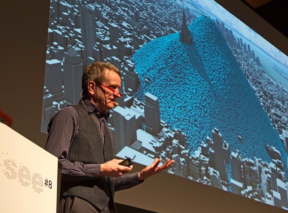
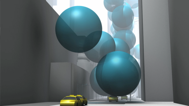
“At 15°C and 1 atmosphere pressure, a tonne of CO2 fills a 10-metre bubble. Our visual presentation, a video, opens with two of these bubbles popping up out of the pavement every second, before illustrating what the volume is over a day and then a year.”
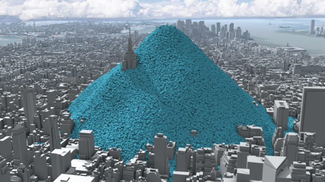
2014 Visualisations of greenhouse gas emissions from New York City – two tonnes per second. The central image shows a day’s worth, burying the Empire State Building, while one year’s worth towers over Manhattan. Watch the video at www.realworldvisuals.com/cv-projects/new-yorks-carbon-emissions.
The video was a huge success, being shown by Antony and his team to Obama’s Technical Director in the White House itself, at a conference in Austin, and then they put it on to YouTube. A few weeks later, Hurricane Sandy brought plenty of discussion of climate change, along with $68 billion dollars of damage and 233 fatalities. Antony’s video went viral, and within hours he was being contacted by dozens of media organisations, all wanting permission to use the visualisation.
Since then, Antony and his team have worked with plenty of big names: BBC, Porsche, Somerset Wildlife Trust, the London Electric Vehicle Company, UN Environment Programme and many more. They’ve also expanded beyond carbon too, to tackle other social and humanitarian issues. It’s still a tricky business to be in, and is certainly not all plain sailing, but Antony is managing to balance running a successful business alongside taking on important projects for NGOs, and not-for-profit organisations who have smaller budgets to commit to these game-changing visual representations. Thanks to a generous grant from Innovate UK, the company is now developing a software-as-a-service approach called Show Me that will enable instant production of high-quality imagery of anything that can be counted or measured.
Which is the most important element to a project – the client, the audience, the data or the story?
These are all key. When a company first gets in touch, we always have an initial call to discuss their proposed project. In the first five minutes I say there are four things we need: first, who’s the audience? Is it six guys wearing suits around the boardroom table, is it everybody in Sheffield or, is it the whole world? Second, what’s the story that you are trying to tell? Third, what data do you have? Importantly, data and the story are different things. We have to carefully check that the data being presented to us by the client are reliable, and not just anecdotal. The fourth question – what’s the budget? For a small NGO or community project we may be able to provide a limited deck of images for a low price, but if a large company want a really cool video, clearly that will be reflected in the cost.
What’s been your biggest project to date?
In 2014 we were asked by the World Business Council on Sustainable Development (WBCSD) to make a video to show how carbon capture and storage (CCS) can play in limiting global climate change. The video was to be shown to delegates at the UN Climate Summit, New York. We were a little subversive in suggesting that the first part of the video showed the world’s consumption of coal, oil and gas, and CO2 emissions in real time. The film goes on to illustrate the speed that unmitigated CO2 missions cause us to exceed the 2°C target for global warming, versus the impact when carbon capture is employed.
It’s kind of ironic that the funders of this video included many companies who are huge players in the fossil fuel industry, and big CO2 emitters. I remember sending the final draft of the video to WBCSD for their feedback and they told us their members liked it but wanted a few changes to be made. One of their observations was that the oil depicted in the oil consumption portion of the video was “too black” – they wanted us to change the colour to soften the look of it, and even sent us photos of oil mixed with other substances so that it looked lighter. We drew the line at this and went back to them saying that we couldn’t make that alteration. They decided to proceed with the video anyway, and it made a real impact at the Summit. Sometimes you have to be open to working with people and organisations that you are not entirely aligned with, in order to work towards an ultimate goal – ours was getting this video seen at the Climate Summit. Find out about WBCSD on their website: www.wbcsd.org
It sounds like you have checks in place to prevent companies commissioning projects which amount to greenwashing?
We’re careful to avoid helping companies do greenwashing, but we’re not averse to working with anyone, provided we are using genuine data. We always insist on contextualising data too. For instance, we will not help a company tell a story about an improvement in their operational emissions without also showing emissions from their products. This way we can avoid oil companies using our work to disingenuously suggest their environmental impact is improving.
The visualisations we make are neutral in the sense that they simply show the data as it is. We do not make them ‘good’ or ‘bad’ or ‘scary’. The context in which they sit though can argue that the numbers are good or bad. I consider projects with companies like Shell and PepsiCo to be a step on a longer journey. Carbon offsetting is similar, really – climate activists might not be happy with it, but it can still play an important role.
Have you experimented with other methods of conveying data to audiences, for example through sound or installations?
Yes. We came up with the idea of putting a 10-metre balloon representing one metric ton of carbon dioxide outside the London headquarters of a global consultancy before the Paris Climate summit. We collaborated with several composers to create a pilot for a sonic landscape of energy and carbon use in buildings in Boston, USA. And we are currently working on a large sculpture depicting embedded carbon reduction for a major UK property company.
Are you optimistic about global emissions targets, for example, Net Zero by 2050?
The best answer about climate optimism is from one of my gurus, Paul Hawken. He said, anyone who follows the science is bound to be pessimistic, but that is balanced by the amazing people around the world working to make a difference. It’s true that the emerging science is more and more troubling. When I first started, we were asking: what is going to happen to our grandchildren, or maybe our children? But the reality is that extreme weather events are happening, now, all over the world. Fixing that is going to be really, really difficult. One of the biggest challenges will be climate refugees because, in 30- or 40-years’ time, large swathes of the planet may be uninhabitable. People will be unable to stay in place and build a decent life.
The science is very troubling. Consider the number of tipping points that we’ve all heard about: accelerated melting of the polar ice sheets, changes in the behaviour and movement of the Gulf Stream. We are already seeing signs of these, and the UK is at risk just as much as the rest of the world. We can expect billions of pounds of flood damage per year in the short term. In the longer term, the UK is on the same latitude as parts of Siberia, Greenland and Canada – a significant change to the Gulf Stream may bring very cold weather and droughts to much of Europe.
But there are also positive social tipping points: the introduction of electric batteries, electric vehicles, renewable energy. The real problem is that some big corporate incumbents are holding things back and trying to maintain the status quo and their position in global markets.
What do you hope the world will look like in 500 years?
The world will be physically changed for sure. But my hope is that we will have completely switched to renewables – primarily solar and wind energy. That countries will welcome climate refugees as citizens of the world bringing benefits not trouble. And that gross income inequality and burning fossil fuels will be a thing of the past. Homo Sapiens, I hope, will have finally lived up to the name and become wise.
Take a look at Real World Visuals via their website: https://www.realworldvisuals.com/

